Well, I’ve been creating a “Friday Art” post on both Facebook and Google+. It’s been a lot of fun, but last week I didn’t post one, partly because I just had gotten back from a trip to Texas. Also partly because I had told a friend that I’d post this and it was getting too big and uncontrollable.
So, I think I’ve got it under control now. Hope you enjoy it.
Topic: How does informal composition work?
A formal composition balances all of its elements symmetrically—often with a center of interest in the center of the composition, but not always. If an object sits on the right side an object of equal weight sits on the left side.

Chancellor Séguier by Charles Le Brun
Informal composition radically moves the elements to balance without symmetry.
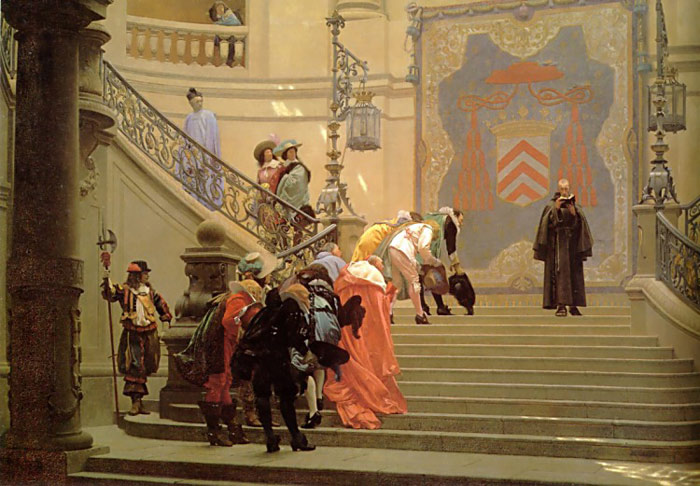
The Grey Cardinal by Jean-Léon Géróme
Some do not understand how this works. How can an informal composition look good if its not organized? The secret is... it is organized, but not in a 1+1=2 sort of way. Let me explain it to you. It’s for your own good. Really. Some may dislike asymmetrical compositions merely because they don’t understand them. This explanation should give you some visual “higher math” to feel better about most paintings, illustrations, and movies. (Did you know that movies use a lot of informal shots? It’s going to bother you now, isn’t it? Well, I’d better get on with the explanation then....)
This is a formal composition:

The center of interest (the boy) is in the center of the picture. The house and the trees on the right balance the tree on the left. The path and the bridge and the trees behind the boy are all in the center of the picture.
Yes, all you math-heads, though the tree doesn’t exactly mirror the house, though the path leans one way and middle trees behind lean another way, and though the bridge is at an angle, this is most definitely a formal composition. Because of the variation some may think of it as informal; however, this formal composition merely uses informal elements for variety. They still are arranged into a formal composition.
What if we took the center of interest and moved him off to one side? (Yes, it’s just called the “center” of interest. It doesn’t have to be in the center. You just have to make people look at it like it is.)

He looks awfully lonely and the other side look really empty. How could we make it look better? I’m glad you asked. Let’s get a little abstract.
First you need to know that everything in a picture does something for the composition. I’ve color-coordinated some of these abstract elements and we are going to step through them quickly to tell you how they work.

The red object is our center of interest. I like to call elements like these target objects, because they attract attention. The blue object is what I call an arrow object. The green object is a frame object. And the yellow object is a halo object. (Appropriate, eh?)
Since those colors and names do not tell you much, here’s more information on each:

Arrow objects point to stuff. Ideally, they point to your target object. They can point like arrows, or if they have a front they can face in a direction. Arrow objects do the bulk of the work making our eyes move around in a painting.

Halo objects form a little halo around the target object to attract attention subtly. They can be light, golden, dark, feathery, solid, or just about anything. They circle around the target object, essentially saying, “Inside here is something special!”

Frame objects stop movement from leaving the composition. This framing object is like a large halo, but instead of indicating something special, it says, “Stop! Look back toward the target object....” Sometimes frame objects act like halos, and other times they act like arrows, but they do a unique job in the picture.
So getting back to my picture with the little boy, what could I do to spice it up a bit?

First, I’m going to put in a large heavy arrow object on the opposite side from the boy in the picture. Notice that as a whole—the bridge, the trees, the house, and the grass by the river—they form an arrow pointing to the boy. Also, notice that both the house and the bridge seem to be facing in the boy’s direction. These are both examples of how arrow object’s work, both as a mass and as individual elements.
Notice how this effectively shifts our attention from the big empty side to the boy. In fact, it’s so strong, we tend to look off the left of the picture. The target object, strong as it is, cannot effectively counteract the strong leftward momentum in the picture.

Second, I’m going to add in the halo object behind the boy. This halo object isn’t the strongest use. Many times artists use halos that compliment or contrast the target object.
Notice that while the halo object helps, it doesn’t solve the entire problem. The left side of the picture still needs help.

Third, I use a frame object! This effectively stops our eye from wandering off the page.

Oh, and last but not least... here’s the path. Just so he’s not floating on air. We wouldn’t want that, now would we? And believe it or not.... the path actually compliments the composition further, but that’s a more advanced lesson.


In fact, this art moment just scratches the surface of how informal composition works. Fine art, comic books, and movies subtly use value, color, space, and action in many ways to balance informal compositions. The next time you see an informal composition, try to figure out how it works. You might surprise yourself! Email me about your findings. Then I can enjoy reading your thoughts!